Google's recent updates to Pixel app icons enhance visual consistency with refreshed designs that align better with Material 3.
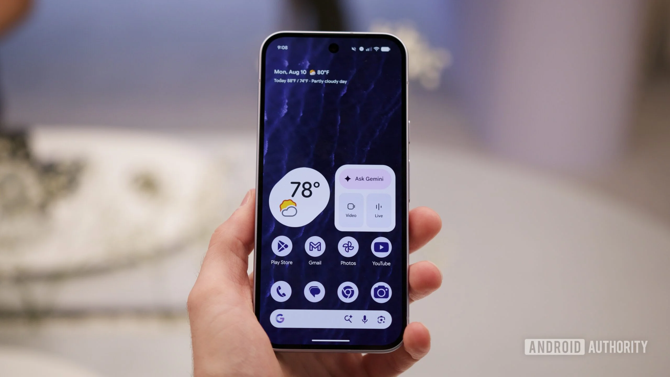
Subtle Redesigns Signal Visual Harmony
Following the launch of the Pixel 11 series, Google is refreshing the icons of its key apps to align with the updated aesthetic trends. This move aims to create a more cohesive look across the Android ecosystem. Over the years, uniformity in design has played a significant role in user experience, especially within platforms as diverse as Android. Users are seeking a seamless interaction with their devices, and part of that interaction is visual clarity. When app icons communicate distinctiveness yet maintain harmony, it speaks to a unified brand vision and enhances user satisfaction.
Updated Icons: What’s New?
Notable updates have surfaced for the Weather and Recorder apps, showcasing a significant shift in design philosophy. The Weather app retains its emblematic sun and cloud representation, but with a refreshed approach. Bright, vibrant colors and refined shading make for a contemporary look against a clean white background. This move toward bolder colors reflects a broader trend in tech design that prioritizes clarity and vibrancy over muted tones. You can imagine how a simple, lively icon can elevate a user's mood during a morning check of the weather.
In contrast, the Recorder app has adopted a more streamlined appearance. The busy background has vanished, making way for a distinct red waveform that stands out. This change is not merely aesthetic; it enhances usability by allowing users to quickly identify the app even in a cluttered app drawer. This emphasis on simplicity and visibility is becoming increasingly paramount in app design, an observation that should resonate with designers focusing on user interface optimization.
Expanding the Design Language
Reports indicate that further revisions are on the way for the Pixel Camera, Calculator, and Clock apps. The Camera icon has witnessed the most significant redesign, keeping an essential camera motif but now boasts a modern blue palette adorned with gradients. Here’s the thing: while it retains its identity, the upgrade makes it feel timely and relevant in a market filled with competitive photography apps. Users often judge apps by their icons; if they seem outdated, they're likely to question the functionality behind them.
Meanwhile, the Calculator app simplifies its design by stripping away the background, leading to a clean presentation of mathematical symbols set within light and dark green circles. This minimalist approach not only makes the icon more recognizable but also reflects a deeper design ethos prioritizing functionality over distraction. The Clock app’s makeover embraces playful shapes from Material 3 Expressive, moving away from a straightforward blue background and white outline towards imaginative visuals. This reflects a movement toward a design aesthetic that’s friendlier and more engaging—again, something most users appreciate unconsciously.
Cohesion Across the Pixel Experience
These changes are particularly welcome for those who have already integrated Material 3 Expressive into their Pixel devices. The updates promise a more uniform look across apps that previously appeared as distinct generations within the Android interface, allowing users to feel more at home within the ecosystem. It's a small but meaningful step towards ensuring that users can navigate their devices without visually jarring contrasts disrupting their experience.
However, these updates might not be immediately apparent. The alterations are subtle enough that users may overlook them without side-by-side comparisons. Yet, the awareness of these refinements can contribute to a slightly more polished experience when navigating through the Pixel ecosystem. If you're working in this space, consider how important visual consistency can be for brand perception. Users may unconsciously prefer platforms that manage these visual transitions well, contributing to loyalty over time. That said, one must wonder: how much more impactful would these updates be if they included a larger scale overhaul rather than just adjustments?
Implications and Future Outlook
The implications of these subtle redesigns go beyond mere aesthetics. They signify Google's commitment to evolving its application interfaces in harmony with user expectations. This level of attention to design details may inspire similar moves from competitors, prompting them to rethink their own app icons. As we’ve seen, users expect not just functionality but also a pleasing visual experience. This means that companies should not overlook design trends when planning updates.
Moreover, as users increasingly rely on a suite of apps throughout their day, cohesiveness in design can enhance productivity. A visually harmonious experience may minimize confusion, especially for users managing multiple apps. So, companies like Google must consider how these design principles translate into actual usability. What this means for users is that their interactions could become more efficient, making these design iterations more significant than they appear at first glance. A bit of thought in presentation can lead to richer user experiences and, ultimately, strengthen brand loyalty. This isn’t just about looking good; it’s about performing effectively.
Discussion
Sign in to join the discussion.